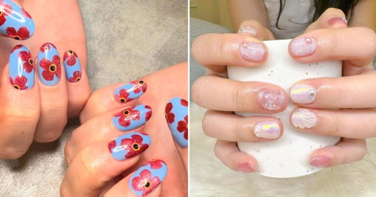
Greece Nails Inspo That Looks Good on Every Hand
I remember the first time I tried a Greece-inspired nail design.
Blue and white. Clean. Looked perfect in the photo I saved.
On my hands, it felt off.
I kept looking at them throughout the day, trying to figure out what went wrong. The colors were right. The design was right. But something didn’t click.
If you’ve ever saved a nail idea and felt disappointed after getting it done, you know exactly what I mean.
That’s when I realized something most people don’t talk about.
It’s not the design that makes Greece nails look good. It’s how well they match your hands.
Nail shape. Skin tone. Length. Even how your hands move when you talk or hold your phone.
All of it changes how the final look comes together.
Here is why some Greece nail designs look effortless on others but feel off on you.
And once you see it, choosing the right design gets a lot easier.
Let’s break that down.
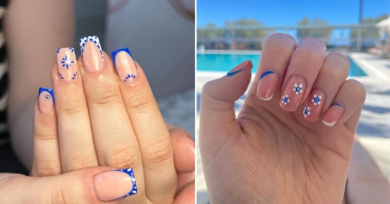
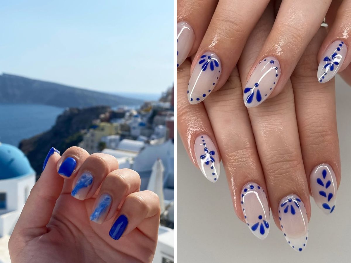
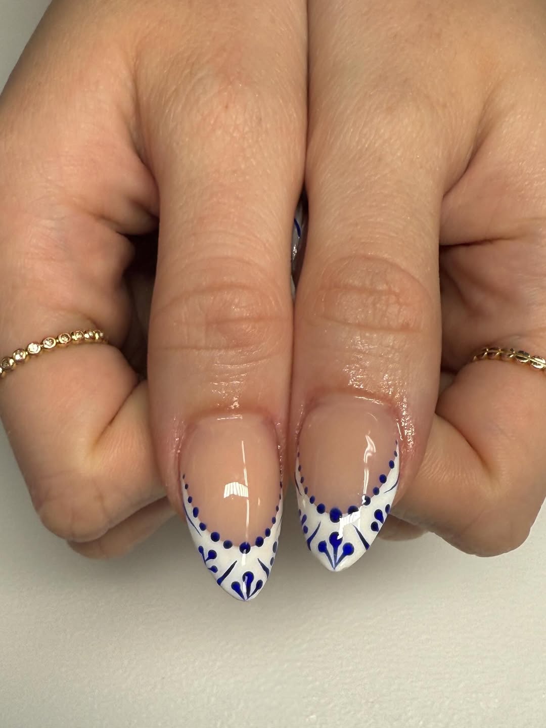
What “Greece Nails” Really Mean (It’s Not Just Blue and White)
At first glance, Greece nails seem simple.
Blue. White. Maybe a little gold.
That’s what I thought too.
But once I paid attention to where the look actually comes from, it started to feel different.
It’s not just colors. It’s a setting.
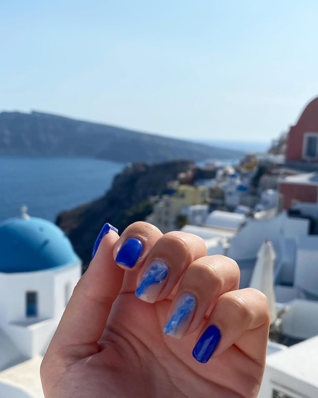
Think about Santorini for a second. Bright white walls. Deep blue domes. Sunlight bouncing off everything so it almost feels too clean to be real.
If you’ve ever seen it, even in photos, you know the feeling.
That’s what people are trying to recreate.
And there’s a reason those colors keep showing up. Greece’s national colors are blue and white, which is why they’ve become the base for so many designs.
But it goes deeper than that.
The buildings themselves shape the look. Santorini is known for its whitewashed houses with blue accents, and that contrast is what makes the whole style feel clean and balanced.
Here’s where things usually go wrong.
People copy the colors, but not the feeling.
Too much blue. Too much detail. No space for the design to breathe.
Try this instead.
Leave some areas simple. Let the white stand out. That contrast is what makes the design work.
Once you see it that way, your choices get easier.
Match the Design to Your Nail Shape First
This is the step that changed everything for me.
And I ignored it at first.
I used to save designs and expect them to look the same on my hands.
They never did.
That’s when I started noticing the difference.
Short nails carry detail differently than long ones. Wider nail beds can make bold patterns feel packed in. Narrow nails can make the same design look clean without trying.
It’s not the design that’s wrong. It’s how it sits on your nail.
Once I started adjusting for that, things finally clicked.
Here’s something simple you can do right now.
Hold your hand out at arm’s length and look at your nails.
If the design looks messy or hard to read from that distance, it’s too much for your shape.
That one check fixes more than you’d expect.
Another small shift that helps.
If your nails are shorter, go for smaller details or cleaner lines. If they’re longer, you can handle a bit more space and movement in the design.
Once your shape is working with you, everything starts to feel more balanced.
And that’s when color starts to matter more.
Start with Colors That Actually Suit You
Not all blues are the same.
This is where I got it wrong early on.
I picked the brightest blue I could find, thinking that’s what Greece nails should look like.
It didn’t work.
The color felt too sharp against my skin. Almost distracting.
Then I tried a slightly deeper blue. Paired it with a softer white.
That’s when it started to look right.
The design didn’t change much. The colors did.
And that made all the difference.
There’s a reason these tones feel so natural together. The white and blue tones reflect the sea and sky around Santorini, which is why they look balanced without trying too hard.
Here’s an easy way to test your colors before committing.
Hold the polish next to your skin in natural light. Move your hand a bit. See how it looks when the light shifts.
If the color blends well and doesn’t feel too harsh, you’re on the right track.
If it stands out too much in a way that feels off, try a softer or deeper version of the same shade.
Once color feels right, you don’t need to overthink the design.
It almost builds itself from there.
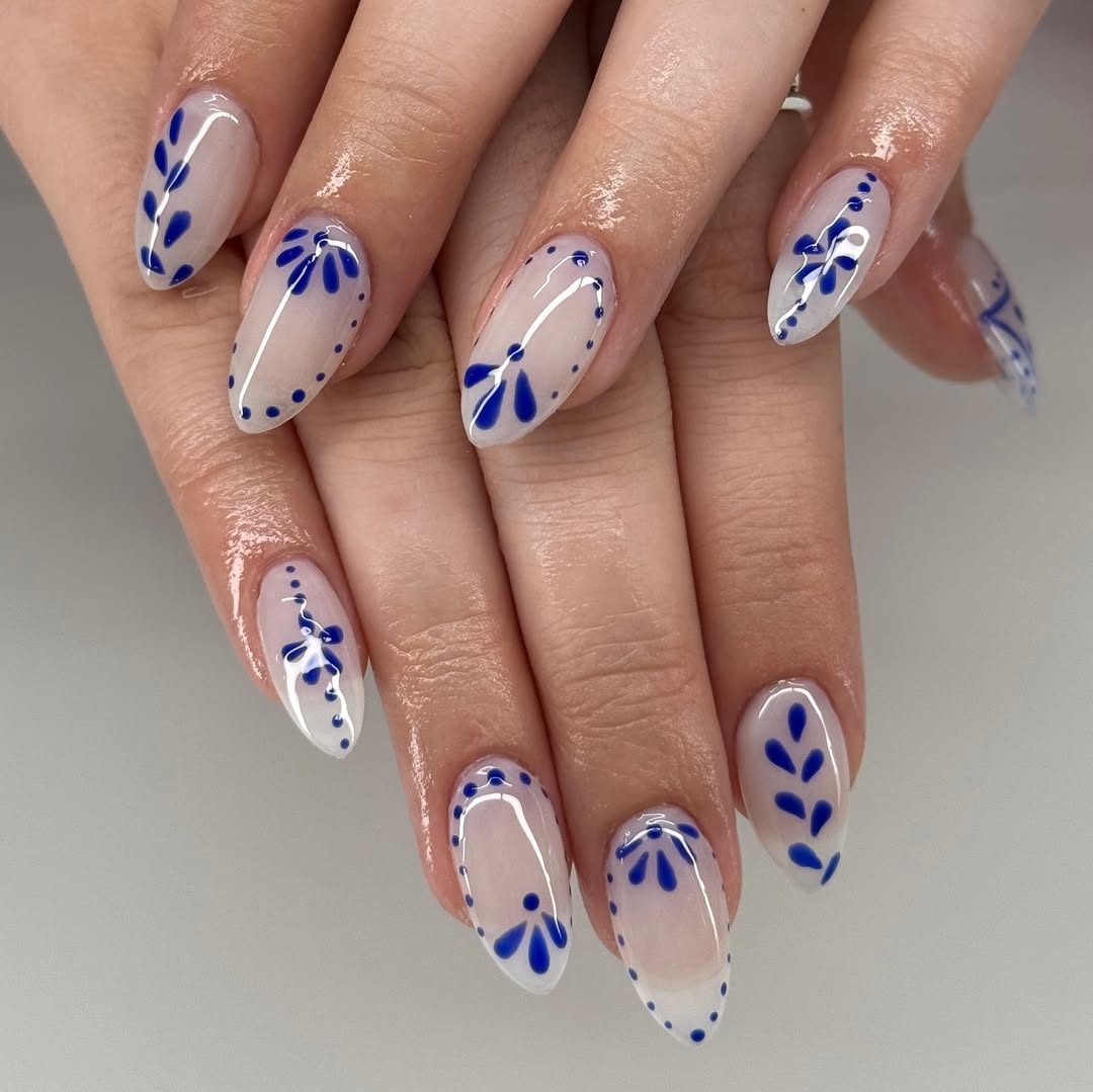
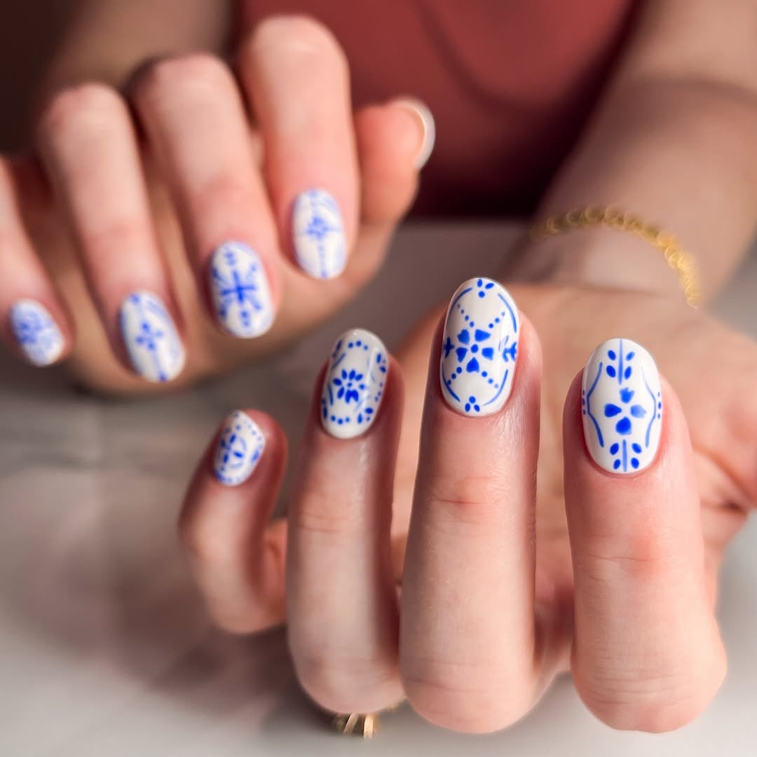
Simple Designs That Always Work
I used to think more detail meant better nails.
It doesn’t.
The designs I saved the most were always detailed. Tiny patterns. Multiple colors. Lots going on.
The designs that actually looked good on my hands were the opposite.
Simple. Clean. Easy to read, even from a distance.
A French tip with a soft blue edge.
A small wave pattern on one or two nails.
A tiny gold accent that catches light when you move your hand.
That’s it.
And you notice the difference right away.
Nothing feels crowded. Nothing feels forced.
The design just sits better.
Here’s something you can try before your next appointment.
Hold your hand out at arm’s length and imagine the design on your nails. If you can’t picture it clearly, it’s probably too detailed.
That one check saves you from overdoing it.
Start with a simple base. Add one small detail. Stop there.
If you feel like adding more, wait a minute.
Most of the time, you won’t need to.
And once you get used to that, the next rule becomes even easier.
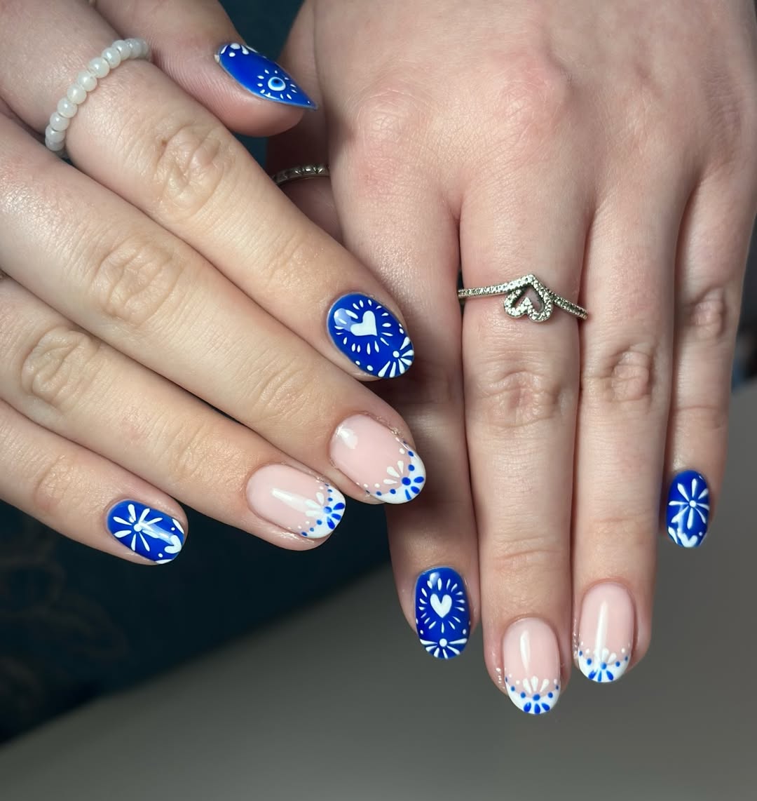
The One Detail Rule That Changes Everything
This rule saved me from so many bad nail choices.
One detail per set.
Not five. Not something different on every nail.
Just one idea that repeats or stands out.
I learned this after one set that had everything. Waves, lines, gold accents, different shades of blue.
It looked fun up close.
From a distance, it looked messy.
Now I keep it simple.
One accent nail.
Or one pattern repeated across all nails.
Or one subtle color shift.
That’s enough.
And it actually stands out more.
Here’s a quick way to use this.
Pick one thing you want people to notice first. The color, the pattern, or the detail.
Build everything else around that.
If you add a second “main” idea, they start competing.
That’s when the design loses its balance.
Greece-inspired looks already have strong contrast.
White and blue do most of the work for you.
You don’t need to add more to make it noticeable.
Once you lock this in, choosing designs becomes much easier.
Length vs Real Life
This is where things get practical.
Long nails look great in photos.
I used to think that’s what I needed to go for.
Then I tried living with them for a few days.
Typing felt slower. Packing became annoying. Even using my phone felt slightly off.
Nothing major, but enough to notice all day.
That’s when I started choosing length based on how I actually live, not just how it looks.
Short to medium length felt easier. Still looked good. Way more comfortable.
And I didn’t have to keep adjusting how I used my hands.
Here’s a simple way to decide.
Think about your usual day. Not a special occasion. A normal day.
Are you typing a lot? Carrying things? Traveling? Using your phone constantly?
If your nails make any of that harder, you’ll feel it within hours.
Another quick test.
Try tapping on your phone or typing on a keyboard with your current nail length. If it already feels slightly off, going longer won’t help.
Pick a length you can live with, not just one that looks good in a photo.
Because the best designs only work if you actually enjoy wearing them.
And once the length feels right, everything else starts falling into place.
How to Make Your Nails Look Good All Week
Day one always looks perfect.
Fresh color. Clean edges. Everything feels right.
Then day three hits.
I remember looking down at my nails once while holding my coffee and noticing a small chip near the tip. Nothing major, but enough to catch my eye every time I moved my hand.
That’s when I started paying more attention to what actually lasts.
Glossy finishes tend to hide small wear better. Matte can look great at first, but it shows marks faster. And designs placed right at the tip usually chip first.
So I changed a few things.
Kept details closer to the center. Chose finishes that don’t show wear as quickly.
Even color plays a role here.
White surfaces in Santorini reflect sunlight and stay visually clean longer, and lighter tones on nails can create a similar effect. They don’t highlight small chips the way darker shades do.
Here’s something you can try.
Before picking your design, think about where your nails take the most impact. Typing, opening things, using your phone. That’s where wear shows first.
Keep that area simple.
You might not notice it on day one.
But by day four, you will.
And that’s when the design still looks good.
Mistakes That Ruin the Look
Even a good design can fall apart with a few small mistakes.
I’ve made most of them.
Too many colors.
Patterns that didn’t match my nail shape.
Details so small they disappeared unless I looked closely.
At first, I thought something was wrong with the design.
It wasn’t.
It just didn’t sit right on my hands.
The result is always the same.
You keep looking at your nails, feeling like something is slightly off, even if you can’t explain it.
Here’s a simple way to avoid that.
If you have to pause and think too hard about your design, it’s probably doing too much.
Another quick check.
Look at your nails from a distance. If nothing stands out clearly, everything is competing.
That’s when the design loses its impact.
Keep it clean. Keep it balanced.
That’s what actually works in real life.
What I Noticed After Trying These Styles Myself
Once I started keeping things simple, everything changed.
Getting my nails done became faster. I wasn’t scrolling for hours trying to decide what to pick.
I already knew what worked for me.
And something else shifted.
I stopped thinking about my nails during the day.
No adjusting. No second-guessing. No wishing I had picked something else.
They just worked.
I’d catch a glimpse of them while holding my phone or reaching for something, and they still looked right.
Even a few days later.
That’s when I knew I got it right.
Because the goal isn’t just how your nails look when you leave the salon.
It’s how they look when you’re actually living your day.
Before Your Next Nail Appointment
Here’s what I do now before booking.
I don’t save twenty ideas anymore.
I pick one.
I look at my nail shape first, not last.
I choose colors that sit well with my skin in natural light.
And I think about my actual day. Not a perfect day. A normal one.
Here’s something you can do before you go in.
Open your saved designs and delete anything that feels too busy or too different from your usual style.
What’s left is usually what will work.
Then show that clearly to your nail artist.
No overexplaining. No mixing five ideas into one.
That alone makes a huge difference in how the final result turns out.
Closing Thought
Greece nails aren’t about copying a design you saw online.
They’re about taking that feeling and making it work for your hands, your style, and your day.
Once you do that, everything changes.
You stop chasing the “perfect” design.
And you start wearing something that actually feels right.
That’s when your nails finally look as good in real life as they did in your head.
Also read: